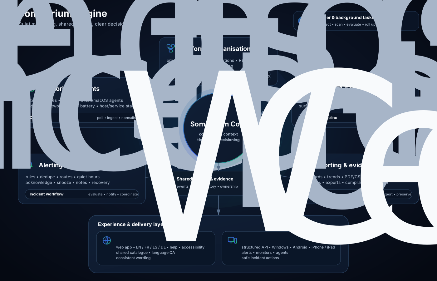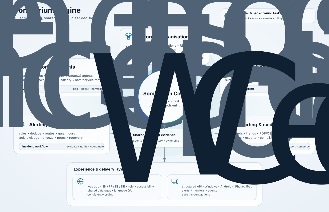

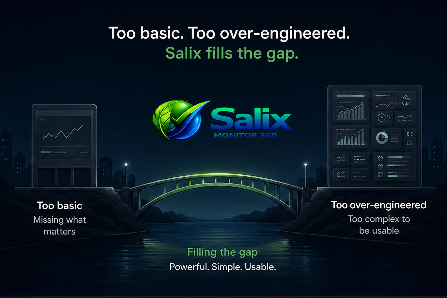
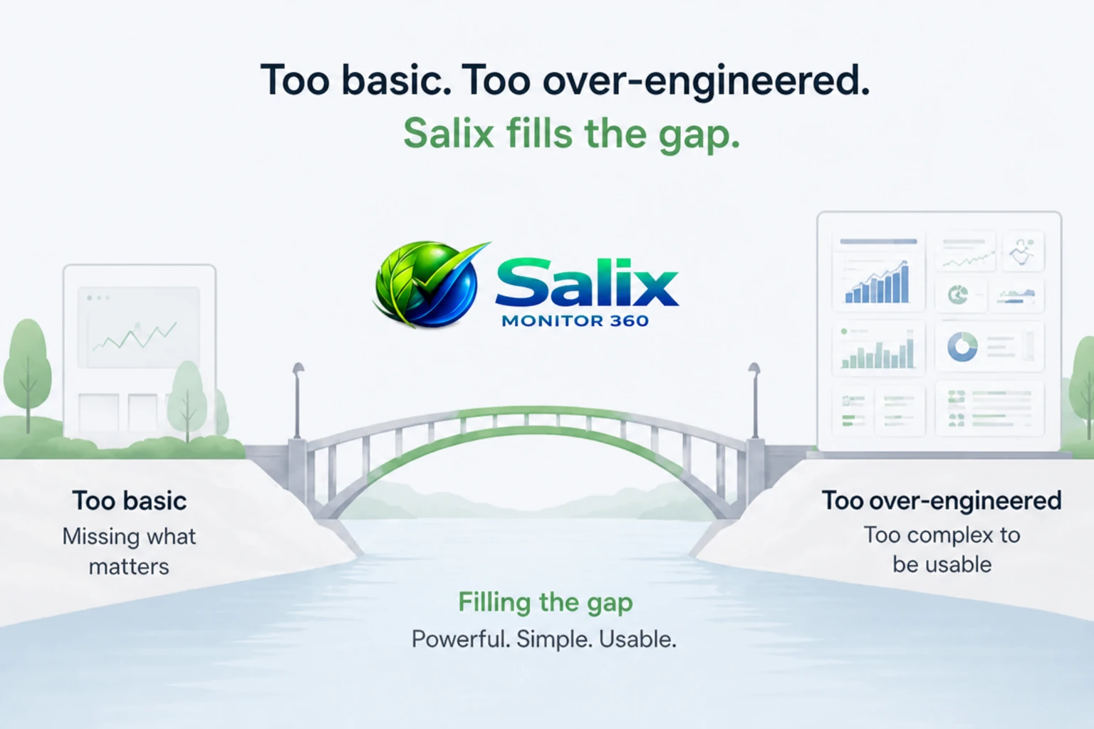
Salix was built for teams that need capable monitoring without a full-time specialist. It keeps the workflows clear, the information useful and the platform understandable to the people who run systems day to day.
Salix didn’t appear out of thin air. It grew out of years of dealing with unreliable tools, noisy alerts, useless dashboards and the endless frustration of “enterprise” software that promises the world but falls over when you actually need it.
The goal is simple: give people a monitoring app that makes sense, doesn’t get in the way and earns its keep every single day.
What is the thinking behind the design?
- Clear wording: labels and charts you can explain in under a minute.
- Honest defaults: sensible intervals and thresholds, not endless checkboxes.
- Context first: incidents with timelines and links, not random alerts.
- Trust: clear organisation boundaries and role-based views.
Salix is used internally, and awkward or confusing workflows are treated as problems to fix rather than quirks to ignore.
How the product keeps improving
- Real-world use: Salix runs on live systems first, then features are refined for everyone else.
- Feedback driven: ideas come from incidents, support calls and “this is annoying” moments.
- Small, safe changes: lots of small releases instead of giant rewrites that break everything.
- Operator-first: screens and workflows are tuned for the people on call at 2am.
The roadmap is deliberately lightweight. If something clearly helps people keep services healthy, it moves up the list. If it adds noise or confusion, it gets cut or simplified.