
Live insight

Server monitoring dashboards that show what needs attention

See server health, website and API status, recent incidents, alerts and agent signals without digging through raw data first. Everyday users get a focused monitoring view, organisation admins see the wider operational picture, and TV dashboard mode turns the same live information into a shared screen.

Operational dashboards

See what is healthy, what changed and what needs attention

Bring current monitor health, alert incidents, agents, jobs and trends into one readable view, then drill into the exact service or organisation behind the number.

“Are systems up?”

Uptime tiles and status charts show exactly how many monitors are OK, warning, critical or disabled.

  • Instant OK/Warn/Crit breakdown across all monitors in scope
  • Seven and 30-day views so you spot patterns not just spikes
  • Click any slice to see the exact monitors behind it

The result: you can answer “how are services performing?” in seconds, not minutes.

Can I filter by team, tag, or environment?

Yes - dashboards can roll up the whole organisation or focus on a slice, so the numbers match the people and services you’re actually talking about.

Do dashboards respect permissions?

Always. Users only see monitors, incidents and posture results they have access to, so screenshots and shared links don’t leak anything awkward.

How quickly does the data update?

Dashboards are built for “live enough to act”. They refresh as checks run, and they show what’s new versus what’s been noisy for days.

Does the data show trends, not just spikes?

That’s the point - compare 24-hour, seven-day and 30-day views to separate one-off incidents from a pattern that needs proper attention.

Can I export a view for reporting?

Where it makes sense, you can pull clean charts and summaries into reports, without having to rebuild the story in a spreadsheet every time.

Will it help non-technical users?

Yes - charts are labelled in clear wording, and the drill-down is there when you need detail. It’s designed to support quick decisions, not produce pretty noise.

The aim is simple: less time asking “what is this showing?” and more time understanding what changed and what needs attention.

TV dashboard mode

The real administration dashboard, fitted to your TV

TV dashboard mode uses the normal organisation administration dashboard rather than a separate wallboard. It removes the routine navigation, fits the dashboard to awkward smart-TV browser sizes and keeps live alerts, monitor health, agent freshness, background jobs, organisation totals and current priorities visible.

The same dashboard, with room-scale controls.

A compact toolbar provides full screen, fit, zoom, refresh and exit controls. Auto refresh starts on by default, while the normal dashboard cards, filters and drill-downs remain available when someone needs detail.

Card order and visibility can be arranged through Configure layout and are remembered by that browser across refreshes and later sign-ins. Reset layout restores the default arrangement. The same users, roles, organisation scopes and permissions continue to apply.

Priority alerts first

Warning and critical alerts stay prominent, so the screen is useful during the working day and not just decoration in the background.

  • Live priority area for active warning and critical alerts
  • Readable status panels for open incidents and monitor health
  • Designed to help teams notice the right thing quickly

Same dashboard and permissions

Organisation admins see the same authorised dashboard scope they use normally. TV mode changes presentation only; it does not create a second data view or bypass access controls.

  • Normal organisation and linked-organisation scope controls
  • Existing role and access permissions continue to apply
  • No separate TV permissions or duplicated dashboard logic

Fitted for real TV browsers

TV mode scales the real dashboard to the available browser viewport, including smart TVs that report surprisingly small page dimensions.

  • Full screen, fit and zoom controls for awkward display sizes
  • Auto refresh enabled by default for current status
  • Saved card order and visibility, with Reset layout available

Dashboards for individual users

When a normal user signs in they see the things they are responsible for first: the services they own, the incidents that touch their work and the alerts that affect their team.

Your “My dashboard” view

A personal starting point that keeps day to day operations tidy instead of overwhelming you with noise from the whole organisation.

  • Tiles for the monitors and services you follow most closely
  • Quick view of current incidents that involve your team
  • Simple “what needs attention now” list for the next few hours

Alerts in clear wording

Users see alerts grouped by rule and monitor, with human readable summaries instead of raw log output.

  • Recent alerts for your area with clear status
  • Links straight into the incident timeline when something escalates
  • Enough context to act without hunting across different tools

Posture and checks for “your” services

People who look after a specific website or system can see how it scores on basics like certificates, headers and DNS.

  • Per-service posture scores with clear explanations
  • Short lists of “fix these next” rather than a long, flat report
  • History view so you can show that things are improving over time

Dashboards for organisation admins

Organisation admins need to know whether the whole picture is healthy, not just a single application. Their dashboards roll up usage, reliability and basic security signals for the whole organisation or for a chosen slice.

Organisation overview

A high level view of how many monitors, agents and users are active and how well they are behaving.

  • Totals for monitors, agents, users and open incidents
  • Success rates across key monitor types such as HTTP, agents and pings
  • Quick sense check of whether things are steady or getting noisy

Teams and ownership

Admins can see which teams own which services and how often those areas trigger incidents or alerts.

  • Breakdown by team or tag so responsibility is clear
  • Lists of “noisy” monitors that create most of the alerts
  • Easy way to spot gaps where nobody appears to own a service

Health of the plumbing

Background agents and jobs are part of the picture too. Admin dashboards include simple checks that show whether the app itself is healthy.

  • Last-seen times for workers, schedulers and agents
  • Job success and failure trends over the last few days
  • Early warning when something stops collecting data

Organisation admins start with the overall picture, then drill into the exact monitor or incident when needed.

Dashboards for app owners

Paid plans can add linked sub organisations for businesses, service providers and internal teams. The admin dashboard keeps their data separate while still providing account-level oversight.

Cross-organisation health

Roll-up charts show how your linked organisations are behaving overall, with quick drill-down into the one that’s trending the wrong way.

  • Uptime and incident trends across linked sub organisations
  • “Noisy organisations” list to prioritise where you step in
  • Compare teams, services or environments without losing context

Governance and ownership

Understand who owns what, where coverage is thin, and whether each organisation has the right teams, monitors and people in place.

  • Organisation-level admin and activity signals
  • Teams inside each organisation so responsibility is clear
  • Visibility into unowned services and recurring incidents
  • Clear boundaries between organisations, by design

Capacity and limits at a glance

Keep an eye on free limits, paid growth and active usage without digging around: monitors, agents, users, teams and organisations over time. The billing view shows whether you are on Free, Standard, Professional or Business Unlimited.

  • Main-organisation usage totals across every linked sub organisation
  • Current usage against Free, Standard and Professional limits, with Unlimited shown as no published caps for normal business use
  • Trends that show when a larger paid tier would make sense
  • Quick prompts for the next sensible step

A dashboard that feels like yours

Branding controls let organisation admins add a custom logo, colour scheme and footer text so internal teams or managed clients see a familiar monitoring workspace.

  • Use the organisation’s visual identity inside the app
  • Helpful for service providers and teams supporting multiple business areas
  • Keep the Salix engine underneath while the workspace feels familiar to users

Multi-organisation dashboards keep each workspace separate while providing consistent reporting and a joined-up view of emerging issues. Billing and limits remain with the main organisation.

“Where are the risks?”

Risk is not only about downtime. Salix pulls posture and vulnerability signals into the same place as uptime.

Posture summary

See certificates, headers, cookies and DNS health in simple groups with clear recommendations.

Vulnerability overview

Aggregated findings by severity with a short description of why each area matters.

Agent and job status

Make sure internal agents are fresh and background jobs are running cleanly.

Examples of the charts you see

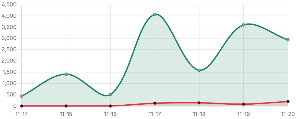
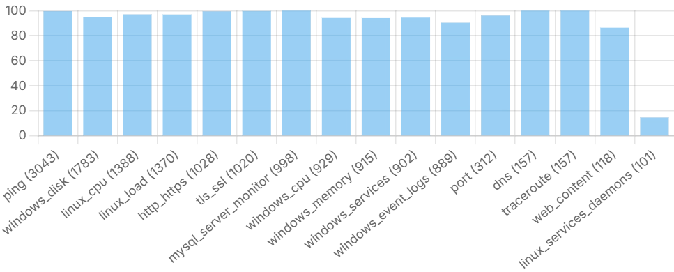
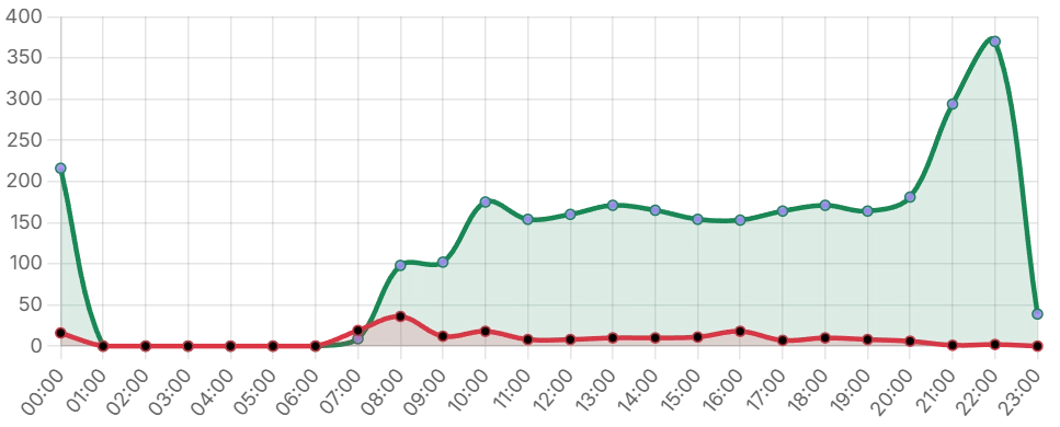
Dashboards combine tiles with focused charts so you can see trends, bursts of failures and where the traffic really is.

Seven-day uptime and failures chart
Seven-day uptime trend with failures highlighted in red.
Bar chart showing success rate by monitor type
Success rate by monitor type with volumes shown in brackets.
Twenty-four hour chart of runs and failures
24-hour view of runs per hour with failures overlaid in red.
Success heatmap (7d × 24h) % OK per hour
Date 0 1 2 3 4 5 6 7 8 9 10 11 12 13 14 15 16 17 18 19 20 21 22 23
Example day 1 100% 100% 99% 100% 100% 99% 100% 100% 99% 99% 100% 100% 99% 100% 100% 99% 100% 100% 100% 100% 100% 100% 100% 100%
Example day 2 100% 100% 100% 100% 100% 100% 100% 100% 100% 100% 100% 100% 100% 100% 100% 100% 100% 100% 100% 100% 100% 100% 100% 100%
Example day 3 99% 100% 100% 99% 100% 100% 99% 98% 99% 100% 100% 99% 100% 100% 99% 100% 100% 100% 100% 100% 100% 100% 100% 100%
Example day 4 97% 94% 96% 97% 98% 99% 98% 95% 74% 100% 99% 100% 93% 99% 99% 99% 99% 99% 97% 99% 99% 97% 98% 97%
Example day 5 65% 72% 84% 91% 96% 98% 95% 88% 70% 25% 72% 95% 94% 94% 94% 94% 93% 94% 94% 94% 94% 94% 94% 94%
Example day 6 93% 89% 91% 92% 94% 96% 97% 98% 95% 92% 88% 32% 95% 99% 99% 100% 99% 99% 100% 99% 98% 98% 98% 96%
Example day 7 93% 91% 92% 94% 95% 93% 88% 32% 73% 89% 91% 95% 95% 94% 94% 93% 89% 96% 94% 95% 97% 100% 99% 100%
 70-100% OK  40-69% OK  0-39% OK